Branding photos are often the first thing someone sees of your brand. They form the non-verbal introduction that immediately shows who you are and what you represent. Even before someone reads your text, your images have already told a story: about style, quality and atmosphere. In this blog, you’ll discover how your photos communicate that silent message, and how you can intentionally steer that visual language.
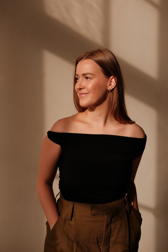
The first impression: your brand feeling at a glance
Within a few seconds, someone forms a judgement about your brand. Not because they’re critical, but because their brain automatically attaches meaning to what they see.
So pay attention to:
Light: soft light feels warm and approachable, harsher light feels powerful and professional. Colour: warm tones create atmosphere, cool tones feel calm and minimalistic. Composition: close-up feels personal, a wide frame feels spacious and luxurious.
Expert tip: Look at your photo for one second and close your eyes. What’s the first thing you feel? That’s exactly what a new follower or client experiences too.
Expert tip: Look at your photo for one second and close your eyes. What’s the first thing you feel? That’s exactly what a new follower or client experiences too.

Activating the senses: photos you can almost feel
The most beautiful branding photos create an atmosphere that feels almost tangible. As if you can feel the texture, hear the space or smell the material. That makes a brand memorable. Examples:
• Soft fabrics or natural materials give a warm, artisanal feeling.
• Smooth surfaces and cleaner lines appear modern and clear.
• Analogue effects or small imperfections make a brand feel human and authentic.
So don’t just think in locations, but in feelings: “morning calm”, “gentle movement”, “bright simplicity”. It results in much richer imagery.
Your visuals make your positioning visible
Branding photos show instantly how you position yourself in the market. People sense whether you are high-end, creative, minimalistic or warm and approachable. Ask yourself with every photo: What kind of energy does this image give off? That energy forms your brand tone, long before any text appears. High energy in a photo (movement, dynamism) often feels modern and entrepreneurial. While calm images (symmetry, soft colours) convey luxury and trust.
Branding photos show instantly how you position yourself in the market. People sense whether you are high-end, creative, minimalistic or warm and approachable. Ask yourself with every photo: What kind of energy does this image give off? That energy forms your brand tone, long before any text appears. High energy in a photo (movement, dynamism) often feels modern and entrepreneurial. While calm images (symmetry, soft colours) convey luxury and trust.
Consistency: the silent signature of a strong brand
Consistency is what allows people to recognise your brand, even without a logo. It’s not about using the same photos, but the same atmosphere, the same light, the same way of looking.
Expert tip: Create a mini visual guide with five fixed elements that always return in your visuals, such as:Type of light (e.g., soft daylight) Colour palette Recurring textures Level of minimalism / calmness Whether or not people are included
This keeps your brand recognisable — even on Pinterest, where image is everything.
Consistency is what allows people to recognise your brand, even without a logo. It’s not about using the same photos, but the same atmosphere, the same light, the same way of looking.
Expert tip: Create a mini visual guide with five fixed elements that always return in your visuals, such as:
This keeps your brand recognisable — even on Pinterest, where image is everything.
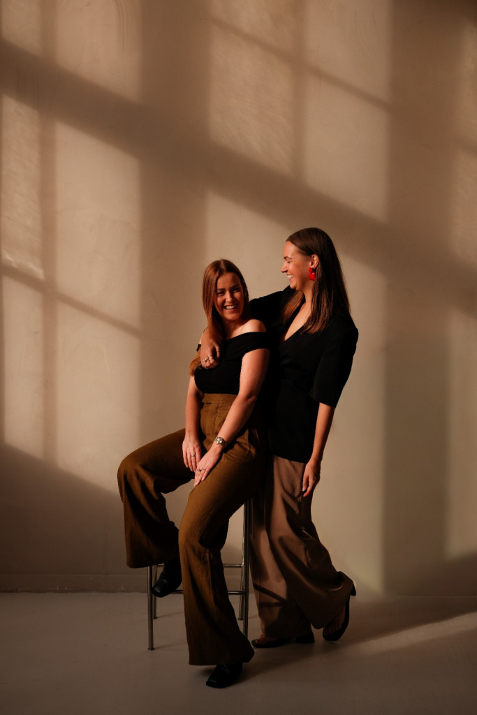
Personal, without constantly being in the frame
Did you know you don’t need to be in every photo to make your brand feel personal? In fact: being subtly present often feels more natural and premium. Think of close-ups of your hands at work. Details from your creation process are also incredibly engaging. Are you a dietitian or a chef? Shoot some visuals while you prepare dishes. Tip: Our kitchen in The Playground offers the perfect setting for this.
Another photo idea: materials that match your brand. Moodboards, inspiration you’ve collected, maybe even a handwritten card or letter. Cropped portraits without full focus on your face. Something that makes you recognisable, such as that one brooch you always wear or your favourite pair of shoes. Use the principle “you are present, but not always visible” from time to time. It keeps your visuals calm, stylish and personal.
Another photo idea: materials that match your brand. Moodboards, inspiration you’ve collected, maybe even a handwritten card or letter. Cropped portraits without full focus on your face. Something that makes you recognisable, such as that one brooch you always wear or your favourite pair of shoes. Use the principle “you are present, but not always visible” from time to time. It keeps your visuals calm, stylish and personal.
The most important question behind every branding photo
Every branding photo should answer one simple question:
“Does this fit the client I want to attract?”
When your imagery aligns, someone feels welcome — even without words.


