Good imagery starts with a background. And those who choose colour, choose character. A backdrop in the right shade can completely transform a story: from calm and refined to bold and energetic. Curious how, as a photographer or creative, you can play with that? These are five original ways to use our coloured backdrops in The Livingroom in a new way.

1. Play with tone-on-tone for a high-end feel
A tone-on-tone setting, where the subject, styling and background all fall within the same colour family, creates a fashionable look. Think of a model in soft peach tones against a backdrop such as Coral (#03), or a beauty shoot in variations of lavender and Orchid (#29).
The effect? Luxurious minimalism. The eye isn’t distracted, but rather seduced by the harmony. Perfect for editorials, beauty campaigns or minimalist brand imagery. Tip: work with diffused daylight or a spotlight to make subtle nuances in texture visible.
The effect? Luxurious minimalism. The eye isn’t distracted, but rather seduced by the harmony. Perfect for editorials, beauty campaigns or minimalist brand imagery. Tip: work with diffused daylight or a spotlight to make subtle nuances in texture visible.
2. Use colour contrasts to create energy
Where tone-on-tone brings calm, contrast introduces a bit more tension. Try combining a powerful backdrop such as Flamingo Pink (#92) or Gulf Blue (#30) with clothing or props in complementary shades. The result is an image that literally pulses with energy. This technique works brilliantly for branding shoots, fashion lookbooks or social content where you want the image to immediately stand out in the feed. Dare to exaggerate, because in a world full of neutral images, those who dare to show colour win.
Where tone-on-tone brings calm, contrast introduces a bit more tension. Try combining a powerful backdrop such as Flamingo Pink (#92) or Gulf Blue (#30) with clothing or props in complementary shades. The result is an image that literally pulses with energy. This technique works brilliantly for branding shoots, fashion lookbooks or social content where you want the image to immediately stand out in the feed. Dare to exaggerate, because in a world full of neutral images, those who dare to show colour win.
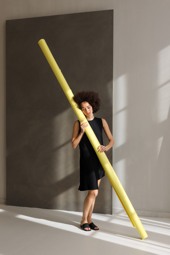
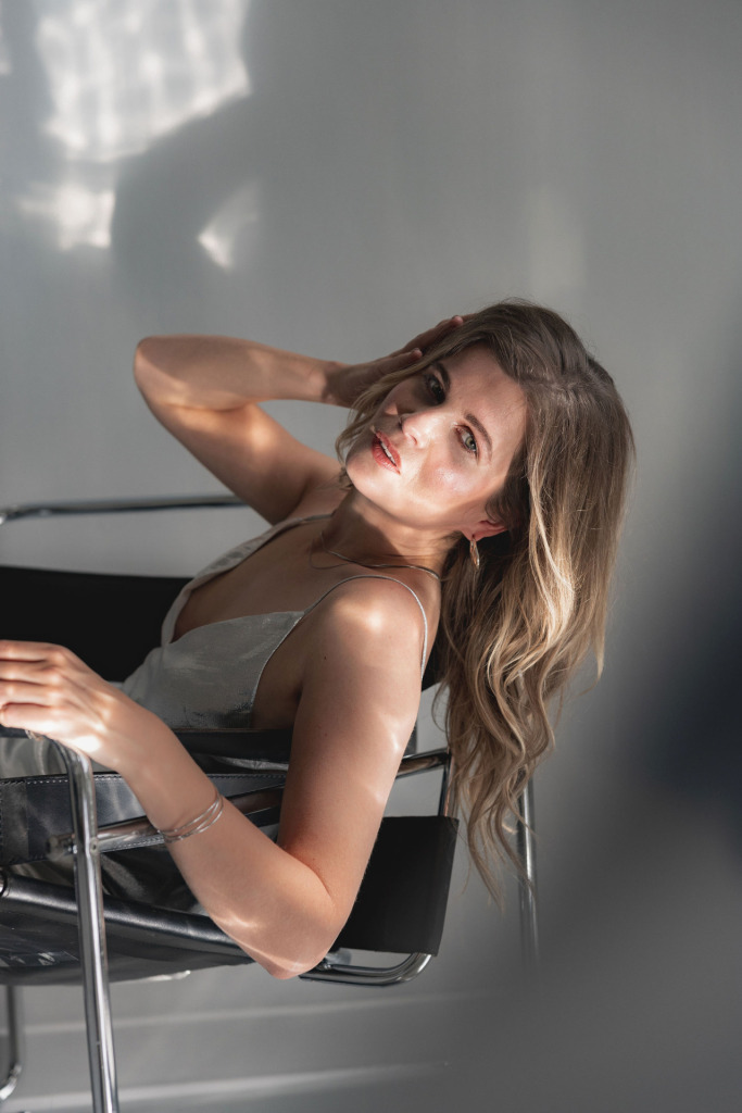
3. Let the backdrop become part of the story
Instead of seeing the background as décor, you can also actively use it as a conceptual element. Use colour to guide emotion or work symbolically. A soft yellow backdrop (#93 Lemonade) evokes optimism and warmth — ideal for lifestyle or wellness brands. A deep black background (#20 Black) emphasises contrast and drama: perfect for conceptual portraits or sleekly designed products.
Instead of seeing the background as décor, you can also actively use it as a conceptual element. Use colour to guide emotion or work symbolically. A soft yellow backdrop (#93 Lemonade) evokes optimism and warmth — ideal for lifestyle or wellness brands. A deep black background (#20 Black) emphasises contrast and drama: perfect for conceptual portraits or sleekly designed products.
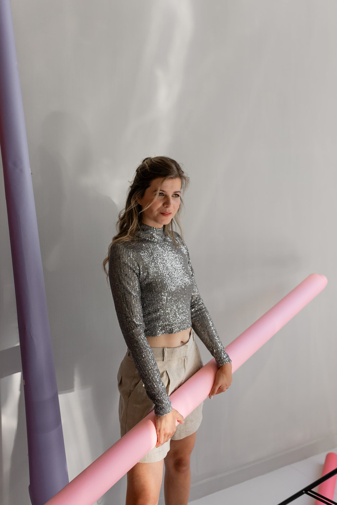
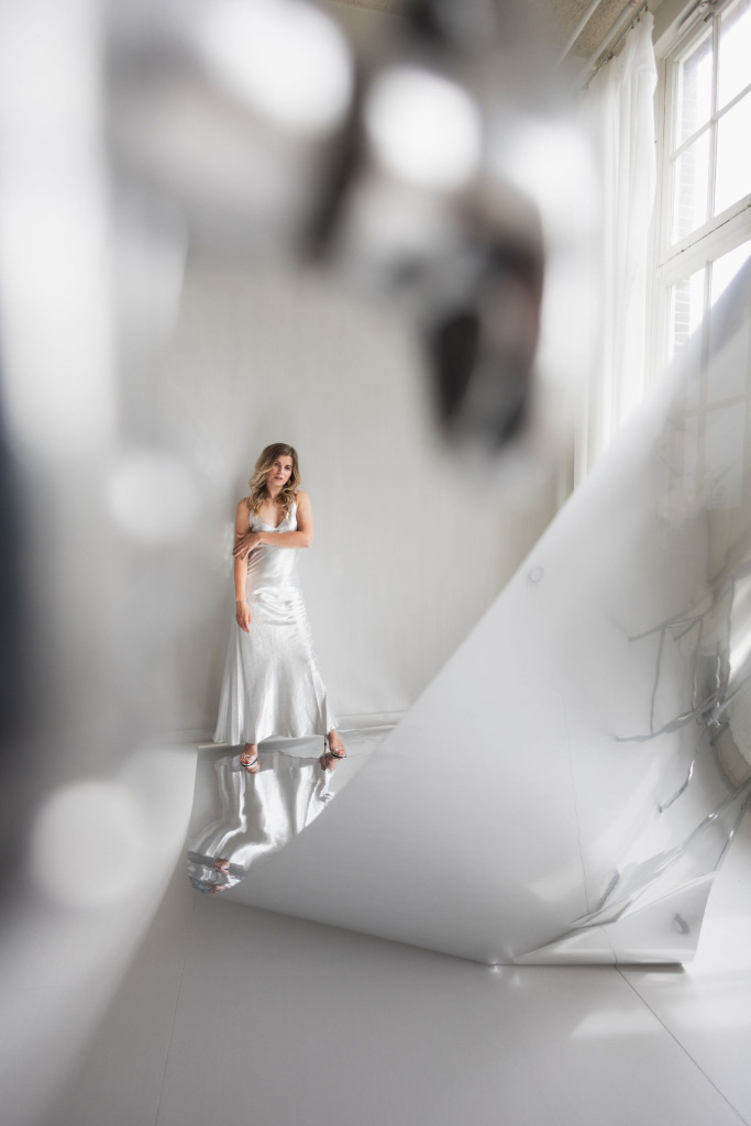
4. Combine paper with metallics for reflection and depth
The ultimate backstage secret of many photographers: layers of light and material. By combining a matte backdrop with a glossy element — for instance, a silver roll or metallic props — you add extra dimension to your image. The reflection introduces movement, and daylight interacts with the surface in unexpected ways. This makes it ideal for artistic portraits, beauty photography or high-fashion editorials. Try: a silver backdrop partially in view, just outside the frame, to create a subtle glow on skin or product. And, experiment with reflection photography— one of our favourite techniques for artfully beautiful images you won’t see just anywhere.
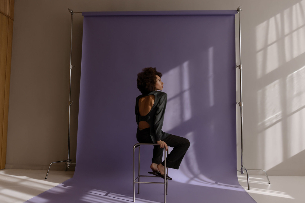
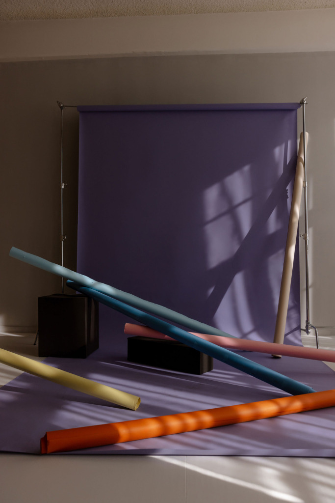
5. Build visual rhythms with multiple colours
Who says you can only use one colour at a time? By combining several coloured backdrops, you create rhythm, contrast and layering. Think of a branding shoot where each image represents a different colour, or a portrait series that evolves from cool blue to warm orange. The result feels like a cinematic journey through emotion and style. Perfect for visual campaigns, moodboards or rebranding projects. Extra advantage: in post-production, you can combine these images into one powerful visual story.
Who says you can only use one colour at a time? By combining several coloured backdrops, you create rhythm, contrast and layering. Think of a branding shoot where each image represents a different colour, or a portrait series that evolves from cool blue to warm orange. The result feels like a cinematic journey through emotion and style. Perfect for visual campaigns, moodboards or rebranding projects. Extra advantage: in post-production, you can combine these images into one powerful visual story.
Colour as a creative signature
A coloured backdrop is never just a background. It’s your chance to convey atmosphere, identity and intent without words. From tone-on-tone subtlety to metallic reflection: every idea starts with one sheet of paper and ends with an image that lingers. Whether you’re a photographer, brand strategist or art director: let colour tell the story and book your shoot in The Livingroom.
Want more inspiration on colour, light and conceptual set-ups? Discover our other articles full of creative photography ideas and styling tips:How to use a free backdrop and spotlight in photo studio The LivingroomReflection photography with silver backdrop
Which photo background suits your shoot?
A coloured backdrop is never just a background. It’s your chance to convey atmosphere, identity and intent without words. From tone-on-tone subtlety to metallic reflection: every idea starts with one sheet of paper and ends with an image that lingers. Whether you’re a photographer, brand strategist or art director: let colour tell the story and book your shoot in The Livingroom.
Want more inspiration on colour, light and conceptual set-ups? Discover our other articles full of creative photography ideas and styling tips: